Reduced Checkout Friction with Single-Column Shipping Form
Overview
Shipping form layout made it difficult to complete the first step of checkout. Increased checkout completion rate by improving the usability and reducing cognitive load.
Hypothesis
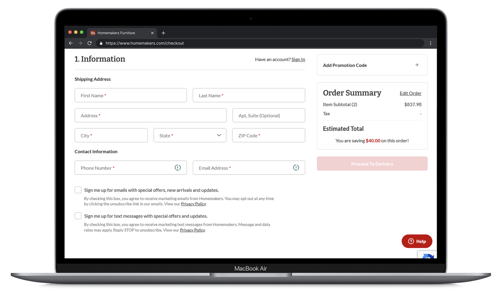
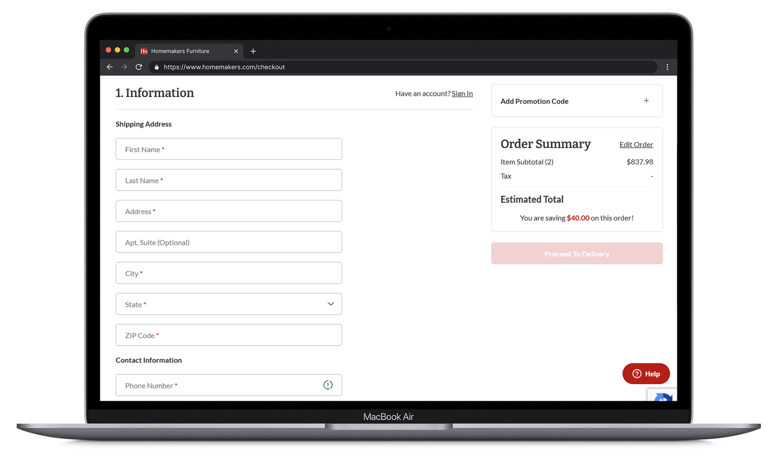
If we change the shipping form to a single-column layout, then we will see an increase in the conversion rate for completed purchases because the linear, vertical flow of the form is less visually intimidating and reduces cognitive load ultimately making it easier for customers.
Test Duration
February 2, 2026 – March 6, 2026
Role
UX/UI Designer
Collaborators
CRO Specialist
Developer
Stakeholders
WHY?
Single-column forms create a cleaner flow, reduce scanning effort, and lower the chance of users missing or skipping fields. This makes it feel faster and easier to complete.
IMPACT
The Results
+6.1%
lift in customers making it to the payment step in the checkout funnel from 40.85%
+13.88%
lift in conversion rate at 94.7% confidence
+$999k
in annual incremental revenue using conversion rate as the forecasting model
TEST DESIGN
What We Tested
- Devices: Desktop
- Control: Multi-column shipping form
- Challenger: Single-column shipping form
KEY INSIGHT
Faster Completion
During the A/B test, it was observed with Microsoft Clarity that users were completing the checkout flow at a much faster rate cutting time down nearly ~1-2 minutes.
KEY INSIGHT
Simplicity
With a single-column layout, funnel friction and chances of missing fields are significantly reduced within the first step.
© 2026 Noah Heuton