
Reducing Friction in Checkout Flow
Overview
I identified the first checkout step as the highest point of user drop-off. By analyzing the existing flow, I found that we were displaying errors prematurely and by combining multiple inputs, we increased cognitive load and created unnecessary friction contributing to ~64% abandonment in the first step alone.
Splitting one dense step into two focused ones
I simplified the checkout journey by breaking dense interactions into clearer and focused steps, improving validation and error feedback, and reducing unnecessary decision-making. Results from a Checkout Form Field A/B test was the deciding factor in changing the shipping address form layout.
Timeline
January 2026 – April 2026
Role
UX/UI Designer
Contributions
UX/UI Design
End-to-End User Flows
Collaborators
Analytics
Customer Service
Sales
Developers
Stakeholders
IMPACT
Funnel conversion rose from 22.7% to 26.5%
+16.7%
increase in end-to-end funnel conversion rate from 22.7% to 26.5% following the first few weeks compared to 30 days before the change
+15.6%
increase in users that are reaching the delivery step from 36% to 41.6% following the first few weeks compared to 30 days before the change
-4.9%
decrease in end-to-end funnel abandonment from 77.3% to 73.5% following the first few weeks compared to 30 days before the change
+8
operational hours per week customer service saves rather than recreating failed orders
RESEARCH & DISCOVERY
High price explained hesitation, not a 64% drop at step one
Given that Homemakers operates in the furniture industry, longer consideration cycles and higher hesitation during checkout are expected due to the larger purchase value.
However, the level of early drop-off suggested that user behavior alone did not account for the loss, pointing to underlying usability issues within the experience.

KEY INSIGHT
Most shoppers quit before they'd finished typing
Majority of the drop-offs occurred at the first step of the checkout, indicating usability issues and friction rather than intentional exit.
KEY INSIGHT
Contact, shipping, and delivery were too much for one step
Grouping multiple decisions into the first step increased cognitive load and made it harder for users to progress which was a direct contributor to early abandonment.
KEY INSIGHT
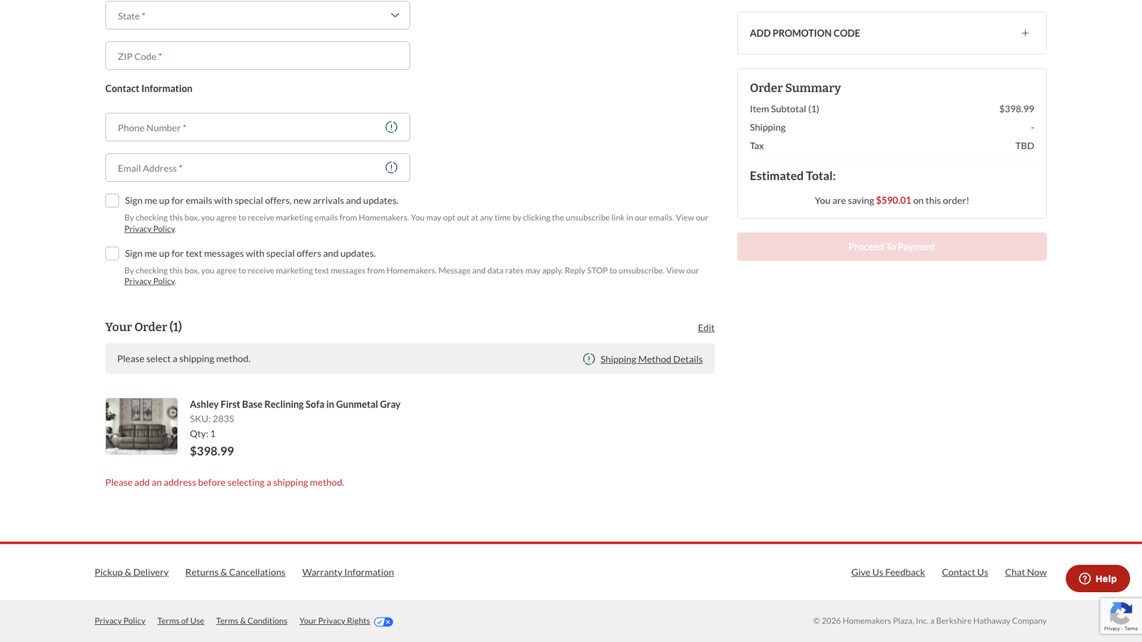
Errors fired before shoppers had a chance to finish
Premature validation and errors introduced friction before users could successfully complete inputs.
HOW MIGHT WE
How might we reduce early checkout friction and improve completion rate by simplifying decision-making?
IDEATION & ITERATION
Fewer steps isn't always better; clearer ones are
While reducing the number of steps is often seen as best practice, the existing checkout showed that combining too many decisions into a single step increased friction and led to early drop-off. Instead, I explored how breaking the experience into more focused steps could improve clarity and progression.
These explorations led to three key design decisions that shaped the final experience.
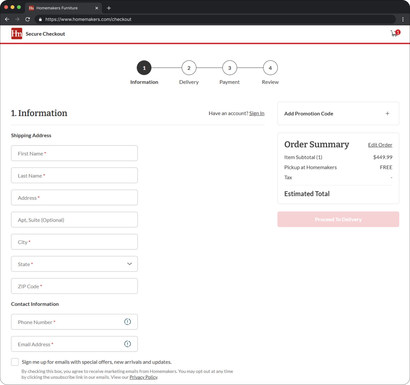
A single-column form made step one easier to scan
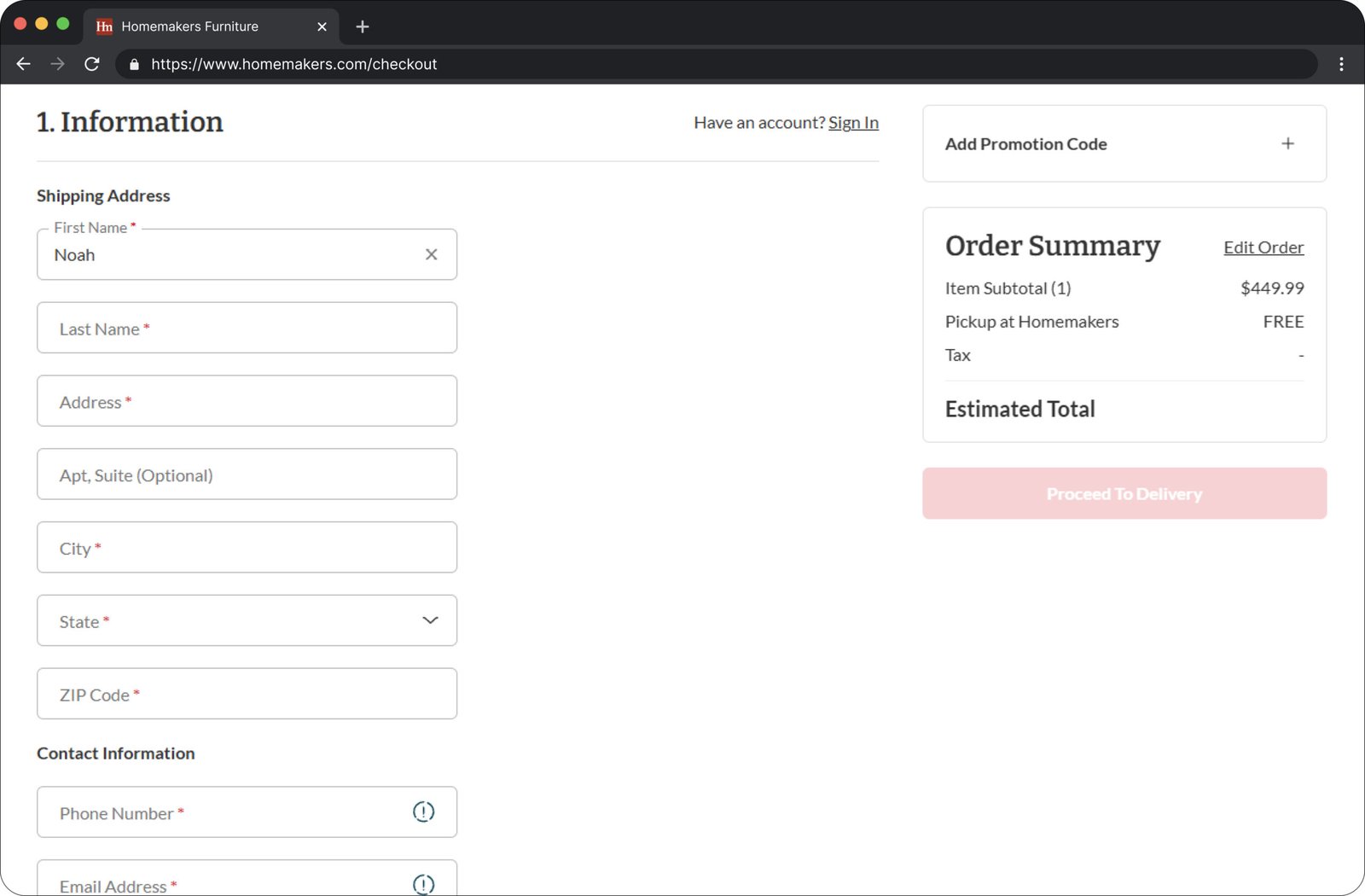
I simplified the entry point of checkout and prioritized clarity in the first step to reduce immediate drop-off. I accomplished this by updating the desktop layout of the form's input fields as a single column that's easy to understand.
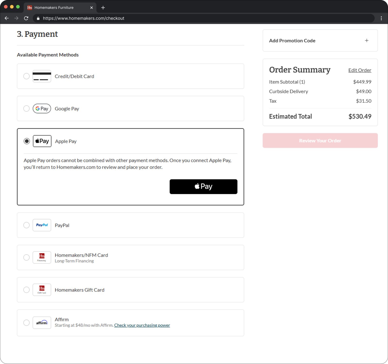
I also aimed to include Apple Pay and Google Pay express checkout as part of the new experience. However, these flows ultimately fell short of expectations and weren't tested to the same depth as the core checkout. These are flows I will prioritize as a separate release rather than as an extension of the main redesign.
Separating shipping from delivery removed a premature error
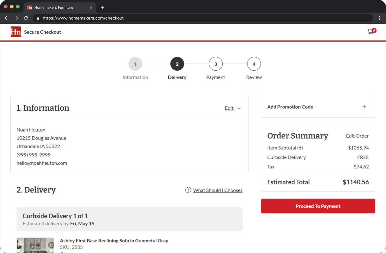
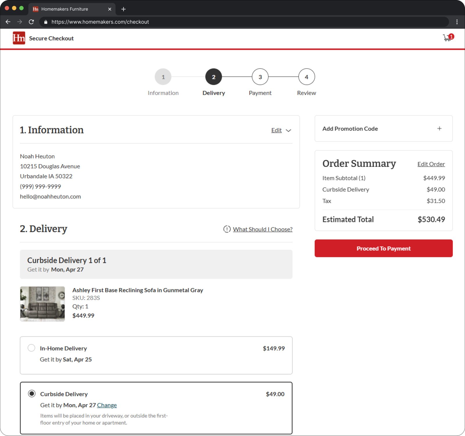
I split shipping and delivery into separate steps to reduce the cognitive load of the first step. This allows the user to focus on one decision at a time, and it also removed an error shown on the first step to enter shipping address information before seeing available delivery methods.
Pre-selecting the most common delivery option cut repeat choices
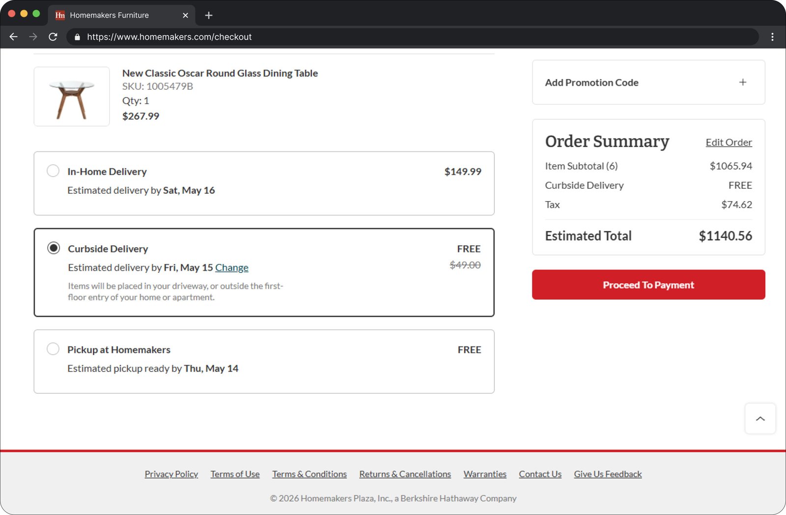
Many positive improvements were made to the delivery selection process during the checkout redesign. Previously, users were required to select a delivery method for each item in their cart, creating unnecessary friction and increasing task completion time. Because delivery method was part of the first step initially, users had a long form plus a long delivery selection process.
After the redesign, items were grouped into a single shipment based on delivery date, and the most commonly selected delivery option amongst all customers was pre- selected using behavioral analytics and historical user data. This reduced repetitive decision-making and streamlined the checkout flow.
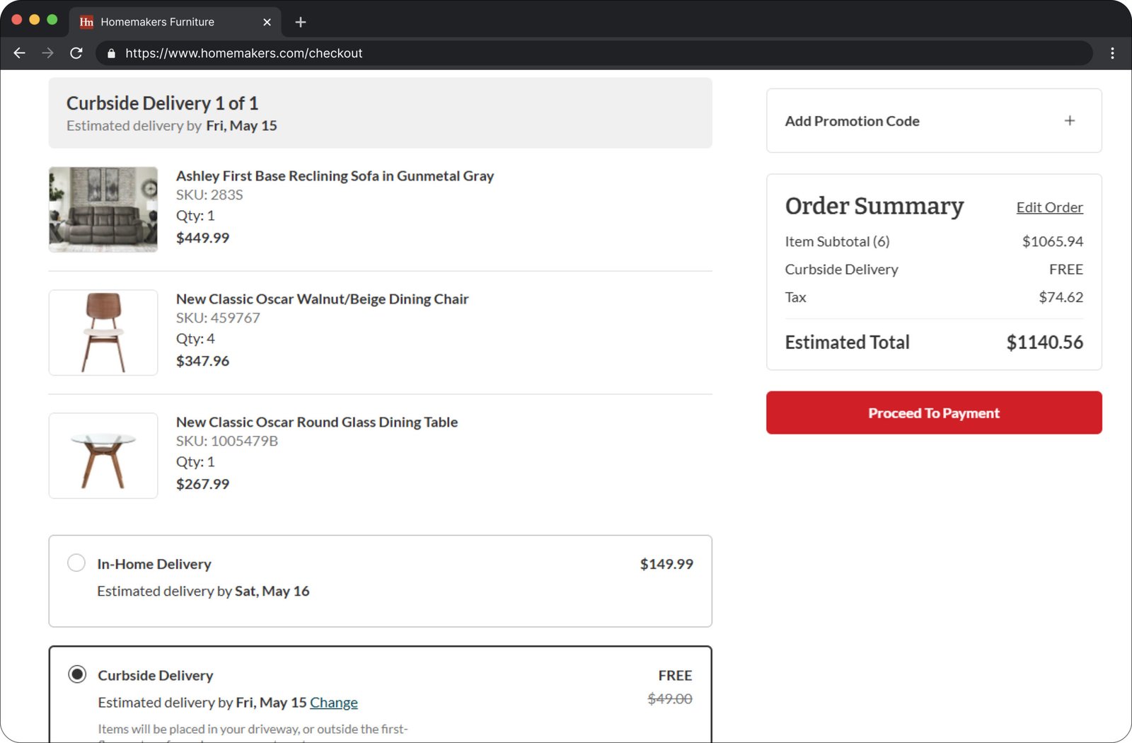
I built checkout to group by date, vendor, and fulfillment type
The checkout was also redesigned with future catalog expansion in mind, ensuring it could support a growing mix of fulfillment types and vendors.
Building on the delivery grouping and automation work, the system was structured to accommodate grouping shipments by delivery date, vendor, and fulfillment type from owned inventory or D2C which may only have one delivery method available.
FINAL DESIGN
The final flow, step by step
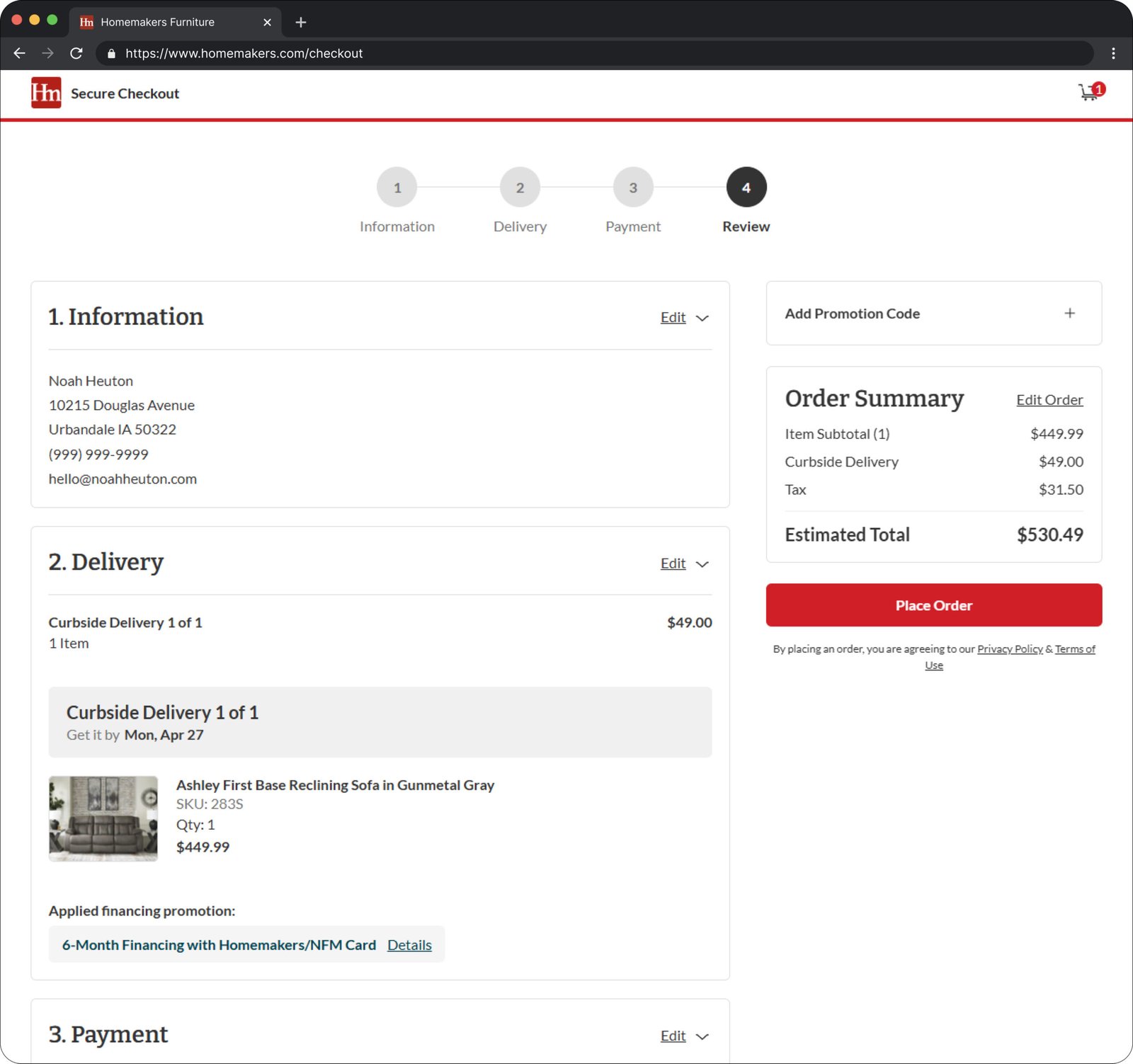
Scope creep is a design decision too
What I'd Do Differently
I aimed to include Apple Pay and Google Pay express checkout as part of the new experience. However, these flows ultimately fell short of expectations and weren't tested to the same depth as the core checkout. Looking back, I would have prioritized these flows as a separate release rather than as an extension of the main redesign.
hello@noahheuton.com
LinkedIn
Los Angeles, CA 90028
© 2026 Noah Heuton